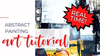
Part 2: Quiet vs. Loud Spaces - Abstract Painting Tutorial - #abstractpainting #mixedmedia |

|
|
In this 2-part video series, I'm specifically focused on finding a balance between quiet, low contrast spaces and loud, high contrast spaces.
******** In Part 1 (https://youtu.be/hzo3TgLYG7E), I create freely in order to produce bold, interesting marks throughout several layers of paint and collage on a 24"x18" piece of paper. In this video (Part 2 of 2), I cut the painting I created in the first video into 4, 9"x12" sheets of paper and continue to add collage and paint as separate paintings. I struggle to find my way for a while (and dig myself into an ugly hole!) but ultimately end up in a good place with these. Materials used: acrylic/mixed media paper, acrylic paint, graphite, color shaper, Caran d'ache Neocolor crayons, and collage. Subscribe for more tutorials just like this: https://www.youtube.com/channel/UCKZwFdFztZw17ANAkvjjHHA?sub_confirmation=1 Comments, questions, and shares are always welcome and appreciated! Share this video: https://youtu.be/xRnZEr3K2WE Follow me for more tutorials, paintings, and behind-the-scenes footage from inside my studio: Instagram: www.instagram.com/jackieschomburgart Facebook: www.facebook.com/jackieschomburgart |